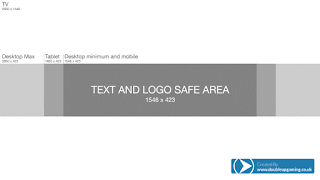
Step One: Template/open the appropriate sized image
(Don't mind the default name if you're going to snag this template -- also, I didn't make it)Step Two: Background
I used part of this image (photo credit to the Animal Jam Graphic Central) for my background, since I liked it and I just adore the Mira.Again, don't mind the default name if you're going to snag the image right from my blog -- it would be better to get it from the AJGC since they have the proper credit for who made it.
Step Three: Text
The text I use varies from what I'm interested in or what the commissioner wants. I use PicMonkey fonts, Google fonts, CoolText, and Tumblr Banners and Headers by Snazzyspace for their multiple fonts. I decided to go with the Porky text option from the Tumblr Banners and Headers site. I had to use the text 2 times since "COSMICCHEETAH" wouldn't fit on my image nor the saving part. Here's the text that I used.I also used the font TrashHand for "Animal Jam."
Step Four: Formatting Effects and graphics
I added a Catcher graphic as well as some effects on PicMonkey. Here's what it looks like so far.That's just without formatting. Here it is WITH formatting:
See how the background progresses from bright and unsoftened to significantly darker and quite soft.
Step Five: Up into Pixlr Express!
When I'm done formatting, I take the formatted version into Pixlr Express and added some stickers and overlays. And by some, I mean many for this separate channel art. If you order a channel art, you can choose on how much overlays and stickers you want. I went into the Accessories category and snagged a halo, I added a fairy dust sticker onto the text, I added some abstract stickers, some lightning stickers... Even a little cat sticker to top it all off. Here's what it looks like with the formatting.I also have a slightly edited version of the same banner.
I just added a halo, some more softening, the fairy dust, some more abstract shapes, and the lightning bolts.
Step Six: Back to PicMonkey & watermark
I opened the new banner up and then I added some more overlays and formats. Here's what it looks like with more overlays and formats. I also added a text watermark and an image watermark, and I like the text slightly better. I also rounded the corners!--
Here's the finished product!
Anyways, that's about it!!
Ciao and Comet On!


XS I just speedpaint mine.
ReplyDelete